

Which art books, prints and posters are available by and about this artist? Here is a sample of items of interest to a typical collector:

Harland Miller, British, b. 1964
Miller made his name reworking the covers of vintage Penguin paperbacks into monumental, wryly funny paintings, swapping in invented titles like Incurable Romantic Seeks Dirty Filthy Whore and Rags to Polyester, My Story that read as one-line confessions. He hit on the format almost by accident, picking up secondhand Penguins while living and painting in Paris, and has spent the decades since mining their orange-and-cream design language for something between stand-up comedy and self-portraiture. The paintings lean on the flat, saturated fields of colour he's said he owes to Rothko, but the wit is entirely his own.
He trained at Chelsea School of Art, finishing his MA in 1988, and has moved between painting and writing throughout his career, his novel Slow Down Arthur, Stick to Thirty was published in 2000, the same year as At First I Was Afraid, I Was Petrified, a novella built around hundreds of found Polaroids of oven knobs turned to "off." That double life as painter and author shows up constantly in the work: titles doing the job of both punchline and confession, often about failure, romance, or the particular gloom of a Yorkshire hometown revisited ("York, So Good They Named It Once").
His paintings have found their way into major private collections, and he's had solo shows from Amsterdam to York Art Gallery, which mounted a survey of his work in 2025.


→
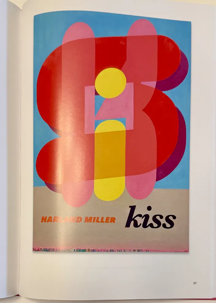
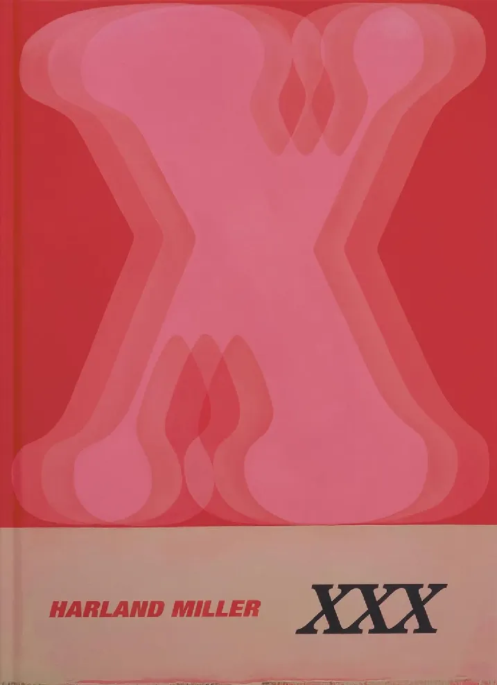
Miller’s "Letter Paintings" synthesize the bold, hard-edged immediacy of mid-century commercial graphic design and Pop Art with the expressive, gestural textures of Abstract Expressionism. The compositions documented in XXX are dominated by massive, vividly colored letterforms rendered with heavy impasto, painterly drips, and intentional surface abrasions. This deliberate textural manipulation creates a compelling spatial tension between the flat, rigid geometry of the typography and the decaying, physical materiality of the paint. By amplifying the scale of these letters, Miller transforms rapid, disposable modern communication into monumental, enduring visual symbols.
Miller's approach here is quite different from Christopher Wool's, who is included in this archive through many books and prints. Wool’s iconic text paintings rely on stark, mechanized, black-and-white stenciling applied to aluminum or canvas. His work evokes urban anxiety and deadpan post-punk nihilism, deliberately fracturing words across awkward line breaks to create cognitive friction. The viewer is forced to decode the aggressive, stuttering syntax. Wool treats language as a hostile, industrialized readymade, often stripping away the artist's hand in favor of utilitarian enamel and rollers.
Miller’s Letter Paintings, as seen in XXX, operate with a deep affection for the tactile surface and the history of painting. While Wool weaponizes text to disorient the viewer and critique the emptiness of modern communication, Miller uses the decaying, painterly materiality of his letters to evoke a sense of nostalgia, humanizing the alphabet through pure color and physical texture.